
Edit Label Setup Detail Tab
Contents
The Label Setup screen is accessed from [ System Operations | Edit Label Setup ] on the File Menu.
Note: if you would like to be prompted for which template to use whenever labels are printed, then simply rename the STOCK LABELS and CUSTOMER LABELS layouts with other names. Further labels can also be set up see How To: Set Up Labels.
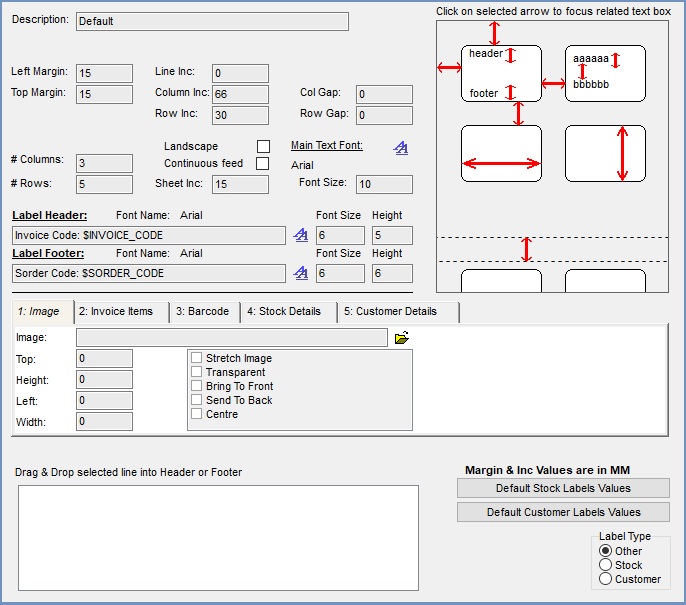
The Detail screen consists of the following sections:
- Description
- Margins
- Layout
- Header and Footer
- Main Text Font
- Image
- Header and Footer fields
- Information Diagram
- Default Buttons
- Label Type
Description
- Description: the name of the label.
Margins
Note: all measurements for margin and Inc values are in MM (millimetres).
To see where each margin relates to the sheet of labels click on the red arrows on the diagram on the right and the appropriate box will be highlighted.
- Left Margin: the gap between the left side of the sheet and the left side of the labels.
- Top Margin: the gap between the top of the sheet and the top of the labels.
- Line Inc: the space between the lines of text on a label.
- Column Inc: the width of the label.
- Row Inc: the height of the label.
- Col Gap: the gap between the columns of labels.
- Row Gap: the gap between the rows of labels.
Information Diagram
The red arrows on the information diagram on the top right show the measurements that are required when setting up labels. When a user clicks on an arrow the corresponding field is highlighted.
Main Text Font
The current font for the labels is shown in this area. Other options are:
- Font Size: is the size of the font on the label.
-
 : allows the user to change the font, font style and size.
Note: this is only visible in Edit mode.
Layout
- Columns: the number of columns of labels on a sheet.
- Rows: the number of rows of labels on a sheet.
- Landscape: (default=unticked) When ticked, stock labels will display in print preview as landscape and also print in landscape format.
- Note: The 'Landscape' option only works with "Stock" labels.
- Continuous feed: (default=unticked) Determined whether or not to send a form feed character at the end of each page. Tick if using continuous stationery (i.e. labels are being printed on a roll). Untick if printing to sheets of labels.
- Sheet inc: the distance (increment) between groups of labels.
- Label Header: populated by dragging selected lines from the Drag & Drop box at the bottom of the popup.
- Label Footer: populated by dragging selected lines from the Drag & Drop box at the bottom of the popup.
Note: more than one line can be dragged and dropped into the Label Header and Label Footer areas. - Font Size: the size of font for the header and footer.
- Height: the height of the header and footer.
- Note: the label will print incorrectly if the height is set too large for the available print area, allowing the header/footer to run into the body of the label.
- Font Name: is the name of the current font used on the header and footer. This can be different for the header and footer.
- : the font can be changed by clicking on this button next to the header and footer.
Note: this is only visible in Edit mode.
Tabs
Image tab
This tab is always active when in edit mode. The "image" tab determines how an image (e.g. logo) is to appear on the label: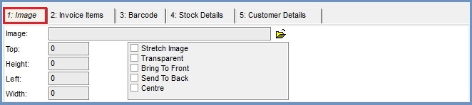
The following settings are controlled by the image tab:
- Image: the name of the image used on a label. This can be selected using the open folder icon on the right of the Image field.
Note All files must be kept in a common location on the server where all users will have access to it. - Top: the position of the top left hand corner of the image when it is placed on a label.
- Height: the height of the placeholder for the image. This maybe smaller or larger than the image.
- Left the position of the left side of the image when placed on a label.
Note: the top and left fields work together to position the image on the label. - Width the width of the placeholder for the image. This maybe narrower or wider than the actual image.
- Image Options:
- Stretch Image: the image is resized to the size of the placeholder maintaining ratio using width and height. If the image is smaller than the placeholder it will be expanded to fit, if the image is larger than the placeholder it will be reduced to fit.
- Transparent: the image will be transparent.
- Bring to Front: the image will be in front of any text.
- Send to Back: the text will appear on top of the image.
- Centre: when image is smaller than the placeholder size defined above then the image will be placed in the centre. If the image is larger than the placeholder size defined above then the image will be positioned in the centre but not all of it will show.
Invoice Items tab
This tab is only active when the "customer" label type radio button is pressed. The "invoice items" tab determines how invoice items should be shown on the label: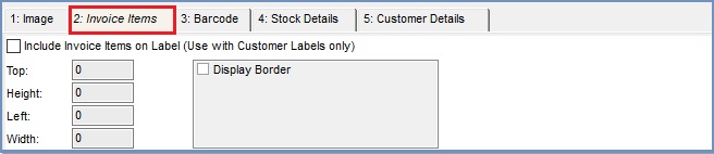
The following settings are controlled by the invoice items tab:
- Include Invoice Items on Label: (default=unticked) If this is ticked then the quantity and stock code for all invoiced will be displayed on the label.
Note: for use only within Customer Labels. - Top: the position of the top left hand corner of the invoice items box when it is placed on a label.
- Height: the height of the placeholder for the invoice items box. This maybe smaller or larger than the image.
- Left the position of the left side of the invoice items box when placed on a label.
Note: the top and left fields work together to position the image on the label. - Width the width of the placeholder for the invoice items box. This maybe narrower or wider than the actual image.
- Invoice Items options:
- Display Border (default=unticked): ticked, a border is printed around the invoice items box.
Barcode tab
This tab is only active when the "stock" label type radio button is pressed. The "barcode" tab determines how barcodes should be shown on the label.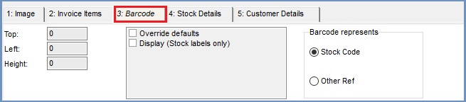
The following settings are controlled by the barcode tab:
- Top: the position of the top left hand corner of the barcode when it is placed on a label.
- Left the position of the left side of the barcode when placed on a label.
Note: the top and left fields work together to position the image on the label. - Height: the height of the placeholder for the barcode. This maybe smaller or larger than the image.
- Barcode options:
- Override defaults: (default=unticked) see the table below.
- Display: (default=unticked) see table below.
Override unticked | Override ticked | |
Display unticked | Will display the barcode in a predefined location on the label. | No barcode will be displayed |
Display ticked | Will display the barcode in a predefined location on the label. | The barcode will be positioned based on the Top, Left position field with a user defined image height. |
- Barcode represents:
- Stock Code: (default) the 'stock code' will be printed as a barcode.
- Other Ref: the 'other ref' will be printed as a barcode.
Stock Details tab
This tab is only active when the "stock" label type radio button is pressed. The "stock details" tab determines how stock items should be shown on the label: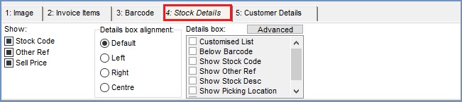
The following settings are controlled by the stock details tab:
- Show:
- Stock Code: (default=ignore) Tri-state option.
- Other Ref: (default=ignore) Tri-state option.
- Sell Price: (default=ignore) Tri-state option.
- Details box alignment:
- Default: (default) When pressed, the default alignment is used (this is maintain backwards compatibility for customers whose systems have the stock label alignment hard-coded.
- Left: When pressed, details will be left-aligned (ranged left) when the stock label is printed.
- Right: When pressed, details will be be right-aligned (ranged right) when the stock label is printed.
- Centre: When pressed, details will be centered when the stock label is printed.
- Advanced: Pressing this button displays the "Advanced Stock Detail Box configuration" dialog (see below).
- Details box options:
- Customised List: (default=unticked) toggles whether the options below are displayed (ticked) or not (unticked).
- Below Barcode: (default=unticked) ticked then the the options below will all be displayed below.
- Show Stock Code: (default=unticked) toggles whether the Stock Code is displayed.
- Show Other Ref: (default=unticked) toggles whether the Other Reference is displayed.
- Show Stock Desc: (default=unticked) toggles whether the Stock Description is displayed.
- Show Picking Location: (default=unticked) toggles whether the Picking Location is displayed.
- Show Supplier Codes: (default=unticked) toggles whether the Supplier Code(s) is displayed. If more than one supplier reference is held for the stock item then they will be displayed sequentially.
Advanced Stock Detail Box configuration
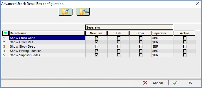
- Detail Name (see above for detailed description)
- Separator: the following three options are all exclusive.
- NewLine: if active and ticked then the Detail will be displayed on the next line relative to the one above it in the list.
- Tab: if active and ticked then the Detail will be displayed with one tabulation to the left relative to the one above it in the list.
- Other: if active and ticked then the Detail will be displayed on the next line relative to the one above it.
- Separator: is only available if the Other checkbox for that Detail is ticked, if available this is the field that the user can define their own separator, e.g. if a two breaks are required then use $BR$BR.
- Active: the Detail will be included on the stock label.
Customer Details tab
This tab is only active when the "customer" label type radio button is pressed. The "customer details" tab determines how customer details should be shown on the label: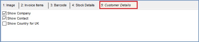
The following settings are controlled by the customer details tab:
- Show Company: (default=unticked) ticking this checkbox causes the company name to be included on the label.
- Show Contact: (default=ticked) ticking this checkbox causes the contact name to be included on the label.
- Show Country for UK: (default=unticked) by default, when the country name is "United Kingdom", this field is hidden (i.e. not printed on the label). Ticking this checkbox results in the country name always being displayed, even when it is "United Kingdom").
This displays available fields for the type of label selected, allowing them to be dragged and dropped into the Label Header and Label Footer areas.
Common label fields
These fields are available for selection, whichever label type is in use:
- $BR - Line Break: adds a break between lines.
- $SYSTEM_ADDRESS: the company address from
[ System Values | General | Your Company ]. - $SYSTEM_NAME: the name of the company address from
[ System Values | General | Your Company ]. - $SYSTEM_POSTCODE: the postcode of the company address from
[ System Values | General | Your Company ]. - $SYSTEM_COUNTRY: the country address from
[ System Values | General | Your Company ]. - $SYSTEM_TEL1: telephone number 1 from
[ System Values | General | Your Company ]. - $SYSTEM_TEL2: telephone number 2 from
[ System Values | General | Your Company ]. - $SYSTEM_FAX: the fax number from
[ System Values | General | Your Company ]. - $SYSTEM_EMAIL: the company email address from
[ System Values | General | Your Company ]. - $SYSTEM_WEB: the company web address from
[ System Values | General | Your Company ]. - $SYSTEM_VAT: the company VAT Number from
[ System Values | General | Your Company ]. - $SYSTEM_REGNO: the company Registered Number from
[ System Values | General | Your Company ].
Customer Label fields
These fields are available for selection when the "customer" label type radio button is pressed, in addition to the "common" label fields:
- $COMPANY_NAME: the company name.
- $COMPANY_CODE: the company URN.
- $COUNTRY: country of the company.
- $COURIER_NOTE: this is the courier note on the sales order.
Stock Label fields
These fields are available for selection when the "stock" label type radio button is pressed, in addition to the "common" label fields:
- $STOCK_CODE: stock code.
- $STOCK_DESCRIPTION: stock description.
Other Label fields
All of the above fields are available for selection when the "other" label type radio button is pressed. However, only those relevant to the label, see Customer Label fields and Stock Label fields will actually be printed on the label.
Default Buttons
When creating labels the default values can be selected by clicking on the appropriate button:
-
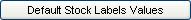 : when creating a new label clicking on this button will set all the values to the default stock label values.
 -
 : when creating a new label clicking on this button will set all the values to the default customer label values.
The default customer and stock label settings are:
- Left Margin = 10
- Top Margin = 13
- Column Inc = 95
- Row Inc = 33
- Columns = 3
- Rows = 8
- Font = Arial size 10
- Customer Label: name and address of customer.
- Stock Label: stock code and description, barcode and sell price.
Label Type
The radio buttons can be used to set the label type:
Other: (default) used when the label type has not been set, see the table below to see what label setup fields are enabled and disabled based on option selection.
Customer: see the table below for the customer label options.
Stock: see the table below for the stock label options.
| Tab | Other | Stock | Customer |
|---|---|---|---|
| 1:Image | Available | Available | Available |
| 2:Invoiced Items | Unavailable | Unavailable | Available |
| 3:Barcode | Unavailable | Available | Unavailable |
| 4:Stock Details | Unavailable | Available | Unavailable |
| 5:Customer Details | Unavailable | Unavailable | Available |
Label Design
Khaos Control is not in a position to provide assurance that a proposed design complies with Royal Mail requirements and suggest clients ask this question of their Account Manager at Royal Mail. The Royal Mail website contains some helpful information regarding addressing requirements.
Integrated Label Design Considerations
Integrated labels is the term used when one or more self-adhesive labels are incorporated within another document (e.g. combined despatch note/sales invoice with peelable delivery and return address labels).
For information, here are some things that clients commonly take into account when designing integrated labels:
- Availability of stationery (e.g. does the design use a "standard" integrated label that is available from more than one supplier?)
- Use of label (e.g. does the label have rounded corners to aid in peeling it off the sheet? is it small enough to be removed from the sheet and applied to the package with one hand or is it likely to curl, requiring two hands to successfully apply it to the package?)
- Does the despatch label include a return address?
- If the Shipping stage is to be enabled in Invoice Manager to enable positive assurance that each package has been placed in a Royal Mail sack, does the despatch label include the correct barcode to enable each package to be scanned as it is placed in the sack?
- If the sheet includes a returns section, does the returns section include the details needed to identify the customer/sales order? Does the returns section include a barcode that allow the correct record to be displayed ready to process the return?
- If the sheet includes a return label (e.g. freepost or business reply service), does the return label include a barcode that allow the correct record to be displayed ready to process the return?
- Where an address appears on a label, is the address block positioned correctly (e.g. has sufficient space been allowed around the address to comply with Royal Mail requirements)?
- Do the label background colour and font size/style/colour comply with Royal Mail requirements?