
Khaos Control Overview
Contents
- 1 Terminology
- 2 Command Interface
- 3 Contact Management
- 4 Window List Menu
- 5 Stock Storage Box
- 6 Dynamic Information Panel
- 7 Stock Types Menu
- 8 Menu and Application Buttons
- 9 Status Bar
- 10 Context Menu
- 11 Searching/Filters
Terminology
Khaos Control has been developed, as far as possible, in line with standard Microsoft Windows applications; utilising Windows 'look and feel' menu structures and short-cut keys. Khaos Control's interface contains a wealth of information and options; whilst at the same time is clear and easily navigable.
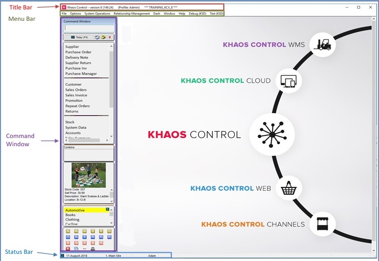
The front page comprises of four distinct sections:
Title Bar
The Title Bar: displays the customer's current version of Khaos Control. New versions are released periodically; customers should update their system at least once a year, although we recommend at least twice a year. The familiar Windows minimise, restore and close buttons are available on the right hand side.
Menu Bar
The Menu Bar: displays the menu options for the system. The menu options are consistent throughout Khaos Control, with an extra menu command being displayed for the active screen. Common menus are:
- File menu
- Options menu
- System Operations menu
- Dash menu
- Relationship Management menu
- Window menu
- Help menu
Command Window
The Command Window assists users to interact with the system. It works as a menu, a window organiser and a command prompt (see Command Window).
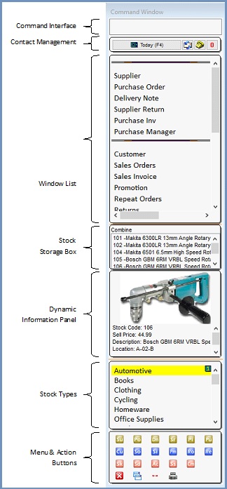
When Khaos Control starts up the Command Window Menu is displayed. The Command Window Menu consists of six areas:
- The Command Interface
- Contact Management
- The Window List
- The Stock Storage Box
- The Dynamic Information Panel
- The Stock Types Menu
- Menu and Application buttons
These menus are used to navigate around Khaos Control. The components expand and collapse when viewed and scrollbars are created where necessary.
Command Interface
The small edit box at the top of the command window can be used to type in command phrases that the system can identify and act upon. The typing of commands into this section is purely optional and is intended for use when you are more familiar and comfortable with the system and wish to speed-up certain operations such as opening a specific customer (e.g. curm435 opens the customer whose URN is "RM435") or creating a new sales order (so.new). Help on using the command window can be found in on the Command Window Commands page. For more information, please see Command Window Commands.
Contact Management
The Contact Management area of the Command Window displays any tasks, actions or appointments which the user needs to be aware of. There is also an indicator to notify the user if any document notifications have been received. For more information, please see CRM Management.
Window List Menu
The Window List acts as a manager of all the currently open windows within the system. A window is a container for a section of the application such as the sales order or accounts screens; other terms that describe a window (and are used within this user guide) are screen and form. Open windows are denoted by red text.
Window List as a Menu
The Window List arranges sections of the application in a hierarchical view comprising of three main areas: Purchasing, Sales & Others. A window can be opened by clicking any item in the Window List.
Window List as a Screen Manager
Although the Window List can be used as a menu, it is not its primary use. The purpose of the Window List is to allow users to quickly move between open windows. For example, it is possible to open the customer window for an existing customer, then create a sales order and whilst editing the sales order, double-click on a stock item to view the stock properties. The Window List displays the three opened windows in red, under their relevant sections. To quickly switch focus from one window to another, single-click on the red item.
Stock Storage Box
The Stock Storage Box on the Command Window is used for temporarily storing stock items via drag and drop from multiple screens. This allows users to drag them into grids that are in edit mode. This will then display the stock codes and short stock description until the user clears them out or closes down the Khaos Control, see Stock Storage Box for more details.
Dynamic Information Panel
Enables users to see dynamic data based on the company or stock item they are currently (or were last) focused on. For more information, please see Info Box.
Stock Types Menu
This section lists all of the stock types currently defined within Khaos Control. Clicking on a 'Stock Type' will drill down through its sub-types and populate the stock screen with the filtered stock records.
Menu and Application Buttons
The buttons in the bottom section of the Command Window are used to open screens within Khaos Control. Allowing the cursor to hover over a button will display the screen name. Clicking a button will open the relevant screen. Definitions of the buttons follow for reference:
Purchasing
 Supplier
 Purchase Order
 Delivery Note
 Supplier Return
 Purchase Invoice
 Purchase Manager
Sales
 Customer
 Sales Order
 Sales Invoice Manager
 Promotions
 Repeat Orders / Call List
 Customer Returns
General
 Stock
Stock System Data
 Accounts
 Sales Summary
 Contact Manager
System Buttons
 Exit Khaos Control
 Close all open windows
 Move Command Window from left to right
 Opens the report generator
Status Bar
The Status Bar displays the date, site details and current user. The Status Bar is of particular importance to users operating multiple sites.
Context Menu
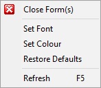
- Close Forms: if used on an open window (i.e. an entry in red) the single screen is closed. If used on a section, such as Stock, all open windows within the Stock group are closed.
- Set Font/Colour: used to change the look and feel of the Command Window. It is possible to change the default font type, font size and font colour as well as the Command Window's background colour.
- Restore Defaults: right-clicking on the Command Interface, Window List or Stock Type menu and selecting Restore Defaults, allows the user to restore the default look and feel of the Command Window.
- Refresh F5: right-clicking on the Command Interface, Window List or Stock Type menu and selecting Refresh will refresh the Command Window. This is particularly useful if changes are being made to Stock Types whilst users are logged on to Khaos Control.
Preferences
Available from the  button on the Button Bar.
- Fit form to available space Shift+Ctrl+F: this option manually forces Khaos Control to fit the screen into the space available.
- Auto fit form to available space (default): selecting this option ensures that Khaos Control automatically fits the screen into the space available.
- Undock/Dock: undocks or redocks a window from the main Khaos Control frame. For more information, please see Docking and Undocking Screens (Window Popout).
- Themes: select from a list of form colours to change all windows and the Command Window to match the chosen colour. Themes may be removed by selecting No Theme.
Searching/Filters
There are a number of filter types that help users search for specific data. This section describes these filter types and provides examples of how they should be used.
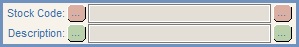
Text Box Filters
Many of the forms contain text box filters, e.g. URN, Company Name etc. on the Customer window.
Text box filters can contain a combination of search values and partial search values. Unless a wildcard is being used, a text box filter will search using the condition 'starts with'. For example, typing 'key' into the Company Name field and pressing return will result in the system searching for all companies that have a company name that starts with 'key' and display the results in the grid below.
Filters can sometimes be combined by entering search criteria in more than one box. For example, in the case of the customer form, if there were a number of customers whose company name begins with 'key', this data could be refined by combining the company's postcode or town.
Wildcard Characters
Wildcard characters are used as a substitute for any other character, or characters, in a piece of text and are useful when the complete text is unknown.
The wildcard character is the % sign. For example:
- To search for companies that contain the word stone, users would enter: %stone%
- To search for companies that begin with, or contain the word stone, users would enter: stone%
- To search for companies that end with, or contain the word stone, users would enter: %stone
Wildcard Buttons
In certain screens text boxes filters have wildcard buttons on either side of them. For example, within the Stock screen, the Stock Code and Description filters:
These buttons work in the same way as wildcard characters (see above). Click on each button once to turn the wildcard on or off .
Drop-down Filters
Drop-down filters offer a list of values to search against. They are active when the filter icon to their right is green . (Red filter icons signify that the filter will not be used). To turn the drop-down filter on / off, click once on the  or
or  icon respectively (
 /
/ traffic light filter).
For example, selecting 'Retail' from the Company Class drop-down in the Customer screen and clicking on the filter to activate it will return all the customers with a Company Class of 'Retail'.
Note: right-clicking on a drop-down filter and selecting Show All will display all filterable options within the drop-down, regardless of whether they have been deactivated within System Data or not.
Lookup Folders
 opens the lookup window associated with the button's field. Once the correct data has been found, double-clicking on the item populates the associated field.
Checkbox Filters
checkbox filters are used to search for results based on whether the checkbox is  ticked or
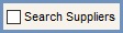
  unticked. For example, the Search Suppliers check box on the Customer window will only search for suppliers if ticked and for customers if unticked. If the Supplier form is opened this check box is automatically ticked by the system.
Tristate Filters
Similar to checkbox filters, tristate filters display a list of available filters with tri-state checkboxes. Unlike checkbox filters, check list filters are usually traffic light controlled ( / traffic light filter).
Tri-State checkboxes have the following states:
 Tri-State ignore: If this state is selected then the corresponding option will NOT be changed.
- Tri-State on (yes): the corresponding option WILL be applicable.
- Tri-State off (no): the corresponding option will NOT be applicable.
Date Field Filters
Date Field
Where appropriate, Khaos Control enables users to filter data by date; it is controlled by a ( / traffic light filter).
- Date From: start date for the search.
- Date To: end date for the search.
Changing the date using the Date To and From fields
- Click: clicking into the date field allows you to key the date required.
Note: this must be in the format DD/MM/YYYY. - Cursor Keys: when the field is selected it is possible to navigate between the day, month and year sections of the field using the left and right cursor keys. Sections of the date are changed using the up and down cursor keys.
Calendar
Select the drop-down arrow on the right of the date field. Khaos Control displays a Calendar: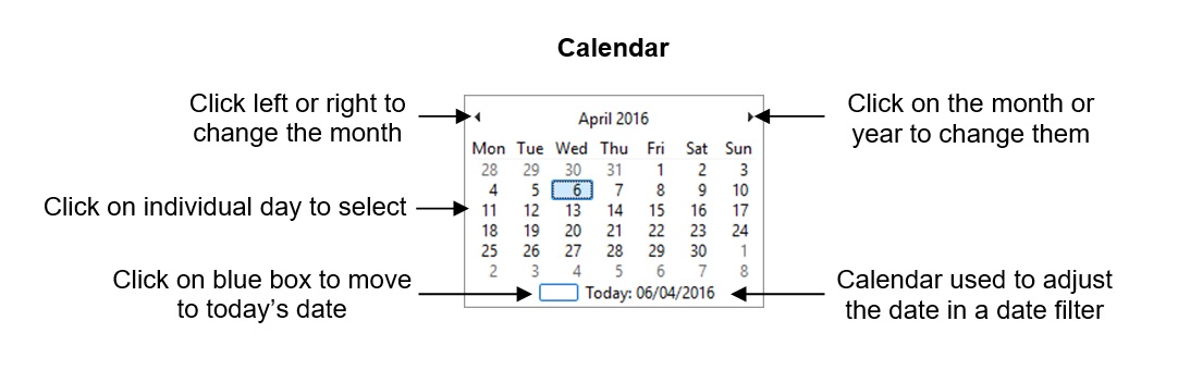
Using the Calendar to change the date
- Clicking on the required date will populate the field and close the Calendar.
- To navigate to a different month select the back and forward buttons in the top left and right of the Calendar.
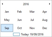
- The user can also navigate months by clicking on the calendar heading to display the months. The required month can then be selected by left-clicking and the relevant date of that month can chosen:
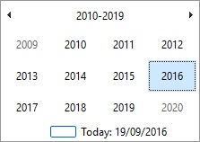
- Whilst in the month view, clicking on the heading again will display years. The required year can be selected by left-clicking which will then return the user to the month view for the selected year which can in turn be drilled down into as per the above example:
Radio Button Filters
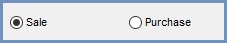
Radio buttons are used to filter results based on whether the radio button is selected or not. For example, the Sale and Purchase radio buttons in the Sales Summary Invoices screen filter the invoices displayed according to whether they are sales, purchases or both.