User Defined Attributes (UDA) Dialog
User Defined Attributes (UDAs) allow you to define additional data fields in the Khaos Control database:
- Company UDAs are used to store additional data against specific customers and/or suppliers. Once a Company UDA has been defined it can be used for any customer or supplier. Examples might include 'Pets Owned' or 'Number of Children'.
- Stock UDAs are used to store additional data against individual stock items. Examples might include 'Author', 'Year of Publication' or 'Coffee Strength'.
Grouping
Stock UDAs can also be grouped based on the stock item's Level 2 Stock Type. This is useful in screens that are already being filtered on the Level 2 Stock Type as only the relevant UDAs for the Stock Type will be displayed in the UDA filter dialog. This works in the following areas:
- The Stock Lookup dialog.
- The
[ Stock | List ]screen. - The
[ Sales Summary | Best Sellers ]screen. - The
[ Sales Summary | Customers ]screen.
See How To: Setup Stock UDAs with Groups for details about setting up the Stock UDAs with groups and How To: Filter Stock User Defined Attributes (UDAs)

The User Defined Attributes (UDA) dialog consists of:
- Action buttons and filters.
- UDA Grid.
- Display Panel and buttons.
- GO button: the GO button must be pressed to refresh the grid.
- Field Name: search the UDA Field Name by description or part description.
- Apply Group Filters: used in conjunction with the Field Name to display the Level 2 Stock Types associated with a UDA.
-
 : delete either the focused on or green-selected UDAs within the grid.
Note: it is wise to ensure that the UDA is not attached to either a stock item or customer record before deleting it. -
 : add a new UDA.
 -
 : Cancel Edit.
 -
 : Save.
 -
 : Edit.
UDA Grid

- Sort: allows the user to define the order in which the UDA will be displayed.
- Field Name: the name of the UDA as it will appear in the UDA filter popups.
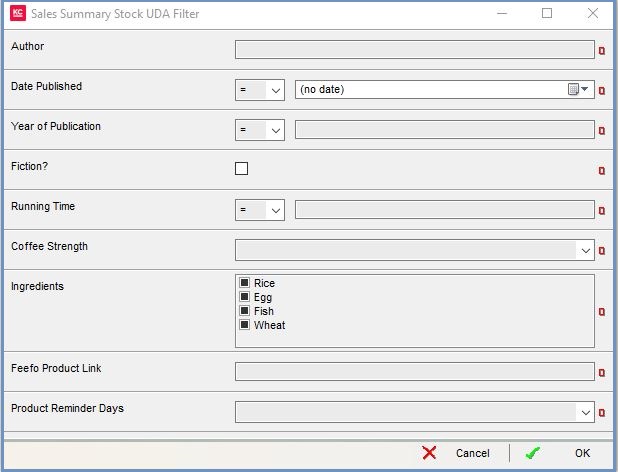
- Type: the type of UDA, the image to the right shows the UDA options setup in the above image displayed in the UDA filter:
- Choice (max 2000 characters) : a singular selection from a list.
- Date: a specific date.
- Integer: whole number only.
- List: multiple selection from a list.
- Number: number with decimals.
- Text (max 8000 characters) : free text.
- Yes/No: Yes/No toggle.
- Export checkbox: if ticked, the UDA will be exported and therefore available on your website.
- Prompt checkbox: if ticked, the user will be prompted to enter the Stock or Customer UDA each time a new stock item or customer record is created.
- Shipping Criteria checkbox: if ticked against a YES/NO UDA, the UDA can be used as a criteria for courier selection in the Courier Bandings table in System Data
Notes:
- Text UDAs support the use of % Wildcard filters.
- Date, Integer and Number UDAs can be filtered on using comparisons:
- = (equal to)
- != (not this option)
- <: less than.
- <=: less than or equal to.
- >: greater than.
- >=: greater than or equal to.
- != (not this option)
- = (equal to)
Display Panel and Buttons
In Edit Mode
- Group drop-down: allows the user to create Stock UDAs grouped by Level 2 Stock Type. These are used when filtering for UDAs to reduce the options available based on the Level 2 Stock Types.
-
 : opens the Stock Type area.
 -
 : closes the Stock Type area.
 - Stock Type area: shown when Stock Type has been selected from the Group drop-down and the
 button has been pressed. A list of the available Level 2 Stock Types with checkbox fields to indicate which Level 2 Stock Types the focused on UDA should be grouped with.
Not In Edit Mode
-
 : step down through the list of UDAs.
 -
 : step up through the list of UDAs.
 - Display Panel: will display the input options for the UDA currently focused on in the grid.
