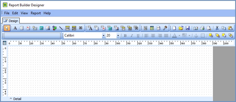
Report Builder Designer - Component Palette Toolbars
- WARNING: Make sure you make a copy of your reports before making any changes, as changes to your existing reports can result in unforeseen layouts that can't be reversed easily.
| | Report Builder Designer is an Advanced User feature. |
Khaos Control's Basic Reports uses only the Report Design tab, not the entire Report Builder utility. Although Report Builder has been incorporated into Khaos Control some features are not available and you may be limited by which fields are available to use depending upon the template you are working with.
Report Builder Designer
Component Palette Toolbars
There are 10 toolbars which can be added or removed from the palette by:
- Clicking on View on the menu bar.
- Selecting Toolbars.
- Clicking on the toolbar you wish to add or remove.

Standard Components
![]() Select Object:
Select Object:
![]() Label: used to display text. Assign the Caption property to control the text value. To resize the label automatically so it fits a changing caption, set the Auto-Size property to True.
Label: used to display text. Assign the Caption property to control the text value. To resize the label automatically so it fits a changing caption, set the Auto-Size property to True.
![]() Memo: used to print multiple lines of plain text in a report. To set the value, assign a string list to the Lines property. To dynamically resize the memo during printing, set the Stretch property to True.
Memo: used to print multiple lines of plain text in a report. To set the value, assign a string list to the Lines property. To dynamically resize the memo during printing, set the Stretch property to True.
![]() Rich Text: used to print formatted text. To set the value, assign the RichText property or use the LoadFromFile or LoadFromRTFStream methods. At design time you can use Report Builders built in RTF Editor to load, modify and save rich text data stored in files.
Rich Text: used to print formatted text. To set the value, assign the RichText property or use the LoadFromFile or LoadFromRTFStream methods. At design time you can use Report Builders built in RTF Editor to load, modify and save rich text data stored in files.
![]() System Variable : used to display common report information such as page number, page count, print date and time, date, time, etc. The type of information displayed is controlled by the VarType property. The format is controlled by the DisplayFormat property.
System Variable : used to display common report information such as page number, page count, print date and time, date, time, etc. The type of information displayed is controlled by the VarType property. The format is controlled by the DisplayFormat property.
![]() Variable: used for calculations via an Object Pascal event handler assigned to the OnCalc event or a RAP event handler assigned to the OnCalc event. Access the Calculations dialog (via the speed menu) or the Calc tab of the Report Designer to code a RAP calculation for this component.
Variable: used for calculations via an Object Pascal event handler assigned to the OnCalc event or a RAP event handler assigned to the OnCalc event. Access the Calculations dialog (via the speed menu) or the Calc tab of the Report Designer to code a RAP calculation for this component.
Note The tab that controls this function is disabled in KhaosControl's version of Report Design Builder
![]() Image: used to display bitmaps and windows metafiles in reports. Assign the Picture property of this component in order to place an image in your report. Use the Report Designer's built-in picture dialog to load images at design-time.
Image: used to display bitmaps and windows metafiles in reports. Assign the Picture property of this component in order to place an image in your report. Use the Report Designer's built-in picture dialog to load images at design-time.
![]() Shape: use this component to print various shapes (squares, rectangles, circles, ellipses). Set the Shape property to select a type of shape. Use the Brush and Pen properties to control the color and border respectively.
Shape: use this component to print various shapes (squares, rectangles, circles, ellipses). Set the Shape property to select a type of shape. Use the Brush and Pen properties to control the color and border respectively.
![]() Line: use this component to draw lines either horizontally, vetically or diagonally. Set the position property to position of the linne. Set the Style property to choose between single and double lined.
Line: use this component to draw lines either horizontally, vetically or diagonally. Set the position property to position of the linne. Set the Style property to choose between single and double lined.
![]() Bar Code: used to render barcodes. The string value assigned to the Data property is encoded based on the Bar-CodeType. If the data to be encoded is in a database, use DBBarCode. The following symbologies are supported: Codabar, Code 128, Code 39, EAN-13, EAN-8, FIM A,B,C, Interleaved 2 of 5, Post- Net, UPC-A, UPC-E.
Bar Code: used to render barcodes. The string value assigned to the Data property is encoded based on the Bar-CodeType. If the data to be encoded is in a database, use DBBarCode. The following symbologies are supported: Codabar, Code 128, Code 39, EAN-13, EAN-8, FIM A,B,C, Interleaved 2 of 5, Post- Net, UPC-A, UPC-E.
![]() 2D Bar Code: used to render two-dimensional barcode symbologies. Supports PDF417 and MaxiCode barcode types.
2D Bar Code: used to render two-dimensional barcode symbologies. Supports PDF417 and MaxiCode barcode types.
![]() Check Box: displays a checkbox using the WingDings font.
Check Box: displays a checkbox using the WingDings font.
Data Components
![]() Database Text: used for displaying values from all types of database fields. Use the DisplayFormat property to format the value.
Database Text: used for displaying values from all types of database fields. Use the DisplayFormat property to format the value.
![]() Database Memo: used to print plain text from a memo field of a database table. This control will automatically word-wrap the text. Set the Stretch property to True and the component will dynamically resize to print all of the text.
Database Memo: used to print plain text from a memo field of a database table. This control will automatically word-wrap the text. Set the Stretch property to True and the component will dynamically resize to print all of the text.
![]() Database Rich Text: used to print formatted text from a memo or BLOB field of a database table. This control will automatically word-wrap the text. Set the Stretch property to True and the component will dynamically resize to print all of the text.
Database Rich Text: used to print formatted text from a memo or BLOB field of a database table. This control will automatically word-wrap the text. Set the Stretch property to True and the component will dynamically resize to print all of the text.
![]() Database Calculation: used for simple database calculations (Sum, Min, Max, Count and Average). The value can be reset when a group breaks using the ResetGroup property.
Database Calculation: used for simple database calculations (Sum, Min, Max, Count and Average). The value can be reset when a group breaks using the ResetGroup property.
![]() Database Image: used to print bitmaps or windows metafiles, which are stored in a database BLOB field.
Database Image: used to print bitmaps or windows metafiles, which are stored in a database BLOB field.
![]() Database Barcode: used to render barcodes based on the BarCode-Type and the value supplied via the DataField property. The following symbologies are supported: Codabar, Code 128, Code 39, EAN-13, EAN-8, FIM A,B,C, Interleaved 2 of 5, PostNet, UPC-A, UPC-E.
Database Barcode: used to render barcodes based on the BarCode-Type and the value supplied via the DataField property. The following symbologies are supported: Codabar, Code 128, Code 39, EAN-13, EAN-8, FIM A,B,C, Interleaved 2 of 5, PostNet, UPC-A, UPC-E.
![]() 2D Database Barcode: used to render two-dimensional barcode based on the BarCode Type and the value supplied via the DataField property. The following symbologies are supported: PDF417, MaxiCode.
2D Database Barcode: used to render two-dimensional barcode based on the BarCode Type and the value supplied via the DataField property. The following symbologies are supported: PDF417, MaxiCode.
![]() Database Checkbox: displays a checkbox based on the value of the field specified in the DataField property. Can be used with a Boolean field (or any other type of field via the BooleanTrue, BooleanFalse properties).
Database Checkbox: displays a checkbox based on the value of the field specified in the DataField property. Can be used with a Boolean field (or any other type of field via the BooleanTrue, BooleanFalse properties).
Advanced Components
![]() Region: used to logically group components together. Use the ShiftRelativeTo property to move the region in relation to another dynamically resizing component (such as Memo, RichText, or child-type Sub-Report).
Region: used to logically group components together. Use the ShiftRelativeTo property to move the region in relation to another dynamically resizing component (such as Memo, RichText, or child-type Sub-Report).
![]() Sub Report: used to handle multiple master details, create sideby-side reporting effects, and hook reports together as one. If you need a report to print within the context of a band, use a child-type subreport. If you need to hook reports together, use a section type subreport. The PrintBehavior property determines the subreport type.
Sub Report: used to handle multiple master details, create sideby-side reporting effects, and hook reports together as one. If you need a report to print within the context of a band, use a child-type subreport. If you need to hook reports together, use a section type subreport. The PrintBehavior property determines the subreport type.
![]() Page Break: the TppPageBreak component is a report control that allows the user to force a new page during report generation. Placing a TppPageBreak component on a report will cause all objects created after the PageBreak to be moved to the next page in the report relative to the PageBreak object's top position.
Page Break: the TppPageBreak component is a report control that allows the user to force a new page during report generation. Placing a TppPageBreak component on a report will cause all objects created after the PageBreak to be moved to the next page in the report relative to the PageBreak object's top position.
![]() PaintBox: the PaintBox component is a report control that can be used to draw directly to a Canvas. Use the TppPaintBox.Canvas property to draw text, lines, images, etc. Use the OnPrint event to draw to the canvas.
PaintBox: the PaintBox component is a report control that can be used to draw directly to a Canvas. Use the TppPaintBox.Canvas property to draw text, lines, images, etc. Use the OnPrint event to draw to the canvas.
==
Edit Toolbar
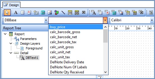
To access this toolbar, navigate to the [ View | Toolbars | Edit ] menu option from the Report Designer main menu. This toolbar will assist in setting the most important property or properties for the currently selected component.
No component selected:
Data-aware component selected
This configuration allows the data pipeline and data field for the component to be set. The dropdown list on the left shows the data pipeline. The drop-down list on the right shows the field name.
Label component selected
Here a label component has been selected in the Report Designer. The Edit toolbar displays an edit box from which the label's caption can be set.
Shape component selected
Here a shape component has been selected in the Report Designer. The Edit toolbar displays the different shape types.
Line component selected

This configuration allows you to move the line to the top, bottom, left or right within the lines selection handles.
