Grid Menu Tools - Graph
What is the Graph Option?
The Graph option allows the user to create a line or bar chart graph to analyse information for selected values in the grid.
Benefits of using the Graph option from the Tools Menu
- In the
[ Sales Orders | List ]tab to view the value of orders over the past year by month. - For viewing the sales of seasonally items in the
[ Stock | Sales/Purchase Orders ]screen over a year.
- In the
Where is the Graph option?
The Graph option is available by clicking on the ![]() button found to the left of grid column headings and selecting
button found to the left of grid column headings and selecting [ Tools | Select.../Graph... ] from the options.
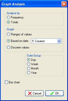
Graph dialog

- Analyse by:
- Frequency: the recurrence of the value.
- Totals: total values.
- Graph:
- Ranges of values: groups of values.
- Based on date: the date, the date options depend on the current screen.
- Discrete values: individual values.
- Date Group: group the results by:
- Day
- Week
- Month
- Year
- Bar chart checkbox: when ticked displays the results as a bar chart rather than a line graph.
Example of Using Graph...
To view the value of orders over the past year by month:
- Go to the
[ Sales Orders | List ]tab. - Change the date filter to display a year's worth of results, i.e. 01 February 2011 to 01 June 2011.
- Focus in the Amount column.
- Click on the
 button and select Tools and then Graph.
 - Select Totals in the Analyse by section.
- In the Graph section select Based on date and Created (the date the sales order was created).
- In the Date Group section select Month.
- Tick the Bar chart checkbox.
- Click on OK.
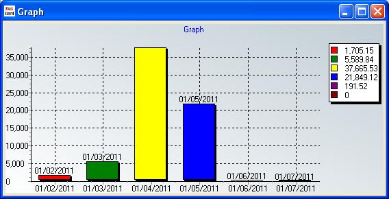
The bar chart will be displayed with the dates along the X axis and the total amounts along the Y axis, for example:

